Data Is Beautiful
Masimatutu
•
Now
•
97%
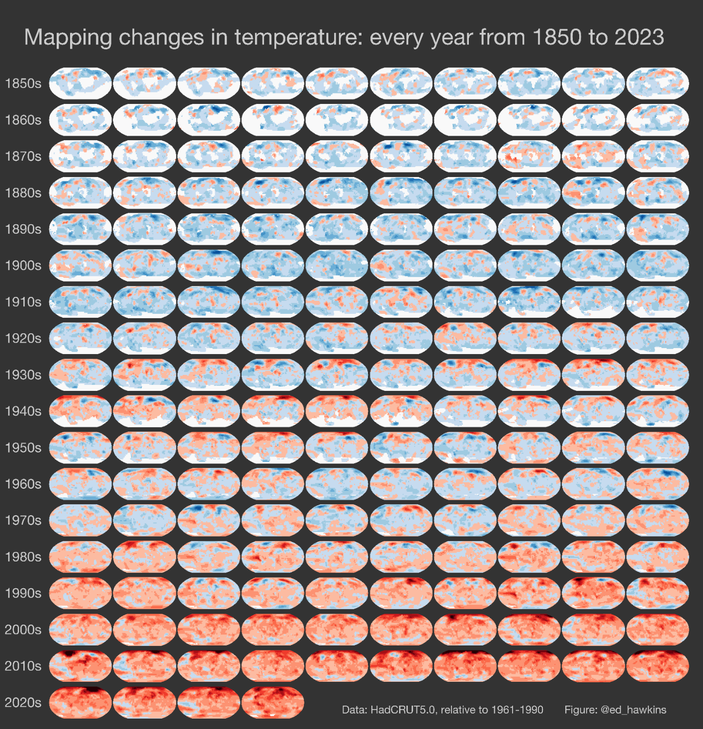
Mapping changes in temperature: every year from 1850 to 2023

Red indicates a higher average temperature than the previous year; blue the opposite.
Comments 30